
When designing for a digital brand, you or your designer has to find a balance between creating something visually novel and exciting whilst communicating all the important stuff. Icons and images come hand-in-hand to set the tone for your user’s experience and invite them to soak up your brand’s identity and ethos.
Here we put together a “how to” guide, focusing firstly on using icons and images in design. Covering all the basics, it’s a great springboard for you to jump off and into your digitally creative pursuits.
Let’s dive in.
How to feature icons successfully
—
Icons add visual accents to digital designs. If you have a lot of info to present, they are a brilliant tool for breaking up text-heavy content into a more digestible and exciting format. In order to do this effectively, you need to be strategic.
Read on to discover five great ways for implementing icons into your visual content.
1. Signify key points
Our favourite spring cleaners, bullet points or numbered lists, work to declutter text. Separating bits of info from the rest of the text body, they highlight key points and takeaways. A more creative approach to the classic list format involves iconography.

Designing unique symbols to further purvey your brand identity and relay your message in a visual way keeps the rhythm light and bouncy for your reader. For instance, take a look at this set of infographics, illustrating the steps that this brand is taking to handle the Covid-19 pandemic. Not only does it explain this important information in a light-hearted, easy-to-read way but it’s full of character and represents the brand’s values.
2. Label charts or graphs
Some designs suit being text heavy (think written articles or the blurb section of a book cover) but other informational content, such as infographics, requires a more visual approach. One of the benefits of iconography is that it allows readers to visualise the text, which can be especially valuable when you’re trying to communicate data or stats.
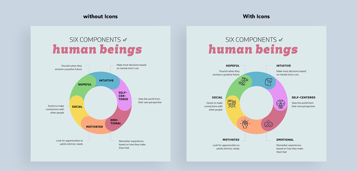
Take a look at the above example, first without icons and then with icons. Doesn’t the option that includes icons look so much less cluttered and easy to read? It’s because there are visual supporting elements for each label, helping to explain each point.
One thing to be sure of is that you’re always incorporating icons that are hyper-relevant to the point, or else they won’t make sense. You’re not adding icons for the sake of adding icons—you’re doing it to ensure your designs are easy-to-understand and visually appealing.
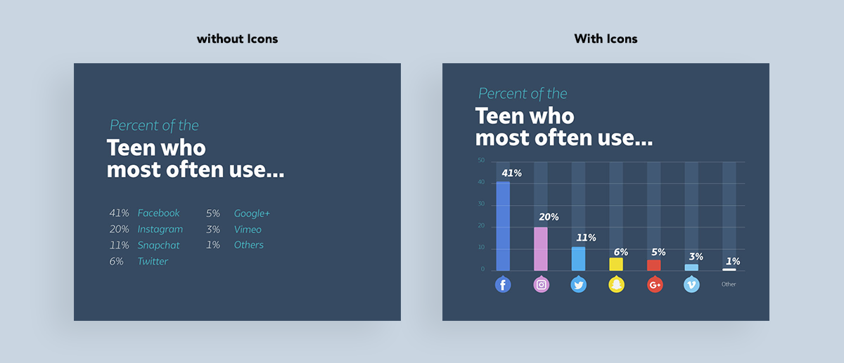
Let’s look at another type of infographic in the below images, noting the differences between these two data visualizations. Swapping written statistics and names for a chart labelled with visual logos creates a clearer, more accessible and, therefore, more efficient design.
3. Show consistency
There are so many different styles of icons, from flat, to outline, to isometric and more, that it can feel a little overwhelming to know where to start. We’ve rounded up three things for you to keep in mind when choosing or designing iconography for your project. Finding the right style, color and size is crucial for consistency and reflecting your brand identity.
Icon style
As there are so many different styles of icons to choose from, it’s important to stick to a single icon style throughout your design, regardless of which one you choose.
Here’s an example to help showcase why this consistency is so important:
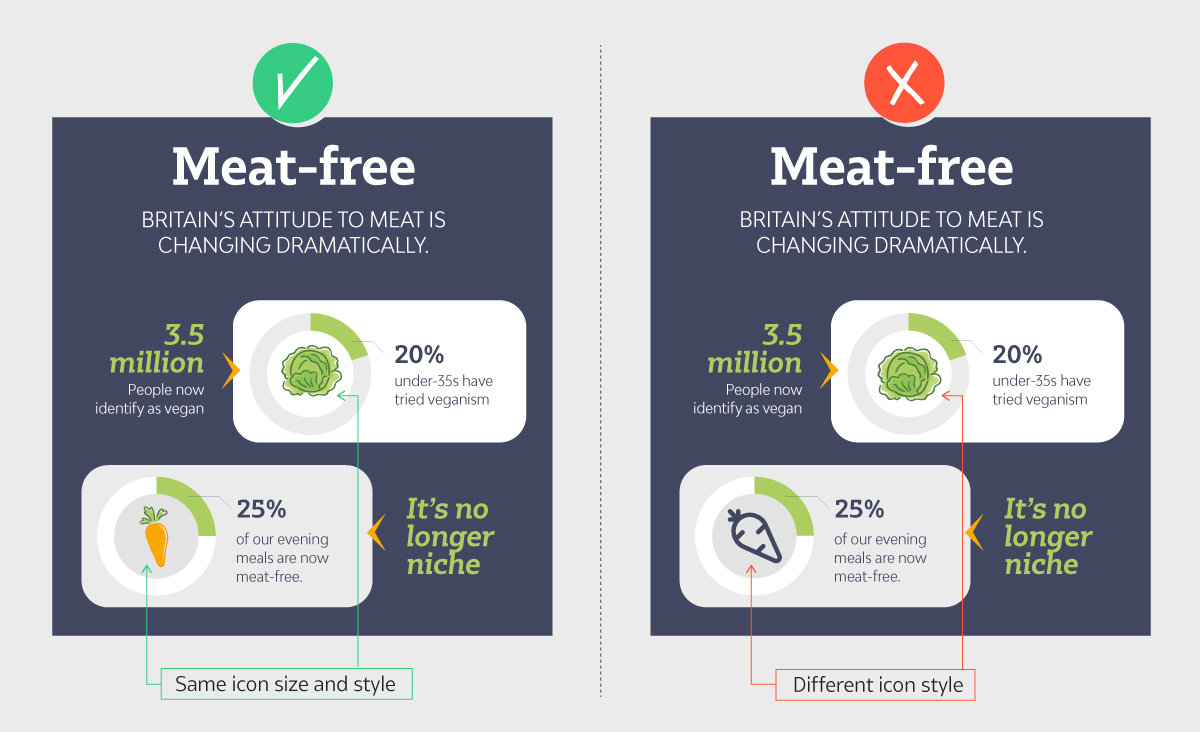
See how in the first instance, the icons have a similar look and feel? It makes the design as a whole feel cohesive and put together. But in the second example, the carrot is a black outline icon while the lettuce remains a colorful icon, throwing the viewer off and disrupting the design.
Icon color
Another important aspect of icon consistency is color. While certain contexts demand that icons retain “logical” colors (see the carrots and lettuce in our previous example), sometimes it’s more fun to get creative. One way to do so is to match the icon’s colour with the data widget they appear in (or the overall color scheme), like the following set of coordinating colors between the statistic and their corresponding icon.
A final major thing to consider when implementing icons into your design work is their size. Whatever message they are denoting, consider whether that message is just as significant as the other points. If so, and you want your reader to consider each one equally, the size of your icons should reflect this as each element in a design project should be streamlined together. What’s more, using the same sized circles helps create a uniform look around some of the more oddly shaped icons, which leads us to our next point…
4. Add a background
As you may have noticed in the previous examples, an icon as a line shape is often dramatic enough. Sometimes, however, you may wish to add an extra contrasting layer to your design to really make the iconography dazzle and this means adding a background. Apart from the usual spherical shapes to back your icons, there are a couple of other creative avenues you can explore, including sizing, shape, placement and transparency… whatever takes your fancy, really.
5. Adding animation
If you weren’t excited enough, why not contemplate animating your icons? Adding ticking, twitching or trembling adds drama and communicates the symbol’s message more effectively. Allow an excess of creativity (and motion) to run through your iconic ideas and see what happens… until then, let’s talk about images.
How to maximise potential of images
—
Got some fab graphics and not quite sure how to fit it into your webpage? Perhaps you’re in the midst of designing a digital space or platform and need some inspiration on jazzing it up. Imagery grabs attention; they entice users towards your call-to-action and provide an enriched experience. Not only this, but they tell your brand’s story and ethos; visually speaking.
Contrasting and complimenting white space and brand colors, featured images are so significant in design that you need to get it pretty perfect to distinguish yourself from competitors. So, we thought it’d be cool to put together five alternative techniques for presenting imagery in your designs.
1. Crack a crop
One unusual way to incorporate images into your designs is to crop them into abstract shapes and create unique patterns. You could start with something simple like a square, circle, or triangle (or something asymmetrical if you’re feeling adventurous) and then play around with the dimensions to find the right fit. If it’s a geometric design you have in mind, you could also try tiling, with some shapes exposing the image and some filled with complimentary/contrasting block colors.
2. Use images as a background
Filling a background with an image creates atmosphere and welcomes the reader to make a deeper connection with your brand. You can try different techniques, like using a transparent box out to display text over the image but make sure you choose contrasting colours and placement to keep things easy to read.
3. Cutouts
Love the main element in an image but not its background? Slice away the bits you don’t need into an image cutout (see donut). This technique gives you a lot more freedom as you’re able to slot it’s main feature into your design without having to worry about the edges of a square/rectangular photo feeling awkward. It also opens up your site to embrace white space. Get creative with it, and see how many similar image cutouts you can use. You might even place your image cutout over part of your text to give more depth to your design.
4. Collages
Since around 1910, the practice of collaging has evolved alongside several art and culture movements. These days, it flirts with white space to create digital designs that are dynamic, packed with character and brand identity and enthralling to look at. A brilliant way to tease or playfully manipulate content, it is the ultimate alternative mode to present imagery through.
You can use a slick grid system as a base or perhaps you want to go “old school”, scan and rip up photos before putting them together into a digital collage oozing a grungy D-I-Y aesthetic. Be explorative with compositions but ensure it all ties in nicely with your overall brand identity and color palette.
5. Add a simple transition
A big entrance never hurt anyone and images are no exception. Static websites can be incredibly powerful, but they can also be unapproachable. A simple motion transition increases interactivity between site and user, offering a memorable experience for the user while creating another chance to express individual brand identity.
Time to take the plunge
—
Icons and imagery may be small additions to your designs, but they can have a huge impact. With these 10 tips you can start integrating them into your designs to take them to the next level. Not sure what type of icon or image will work for you? The best approach to perfecting digital design is through experimentation. Choosing the right icons and imagery and learning how to manipulate them to fit the brand aesthetic of your dreams is a process and guess what—it’s fun!
Article Provided By: 99 Designs
![]()
If you would like to discuss Your Logo with Mojoe.net or your website’s analytics, custom logo designs, social media, website, web application, need custom programming, or IT consultant, please do not hesitate to call us at 864-859-9848 or you can email us at dwerne@mojoe.net.