
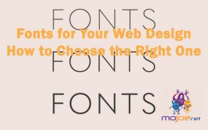
Though it may look like a trivial element, however, choice of fonts influences the success of your web design. It can immediately catch the attention of your audience and present a lasting impression.
Selecting fonts should excite you because it’s one of the most important decisions in web design. And with this comprehensive guide, there are more font options than ever before! So get started on making your design the best it can be today by checking out this article.
In case you are looking for a font library that provides good quality fonts at a low cost, the Font Squirrel is a great place to look. They have an extensive selection of fonts and developers can purchase them by the hour, month, or year. And all the time, they provide free preview demos of their fonts before they purchase them. I have been using Font Squirrel for the last two years and I am always impressed with their quality.
The font can also be a play on your, or your client’s name. Again, personalizing is important, and doing so with a font choice makes the design stand out. Try out some fun fonts for his or her name to create a nice cohesive design.
Things to consider when choosing fonts:
Communications play an important role in web designing for establishing a good connection between the website and the users. Communications refer to the textual part of the website where good typography makes the reading seamless for the users, while bad typography turns users off. It is well known that the legibility of the text is one of the most important criteria to design for. And it’s not an easy task, since you need to think smartly while choosing a font.
Here are 10 key points that can help you choose the best fonts for web your web design for better readability and aesthetics.
1. Limit the number of fonts
If you use more than three different fronts for the same website, then your web design may turn out to be shapeless and unprofessional because the excess of type sizes and styles in one website can ruin its layout.
So, for a good website, you must have to limit the number of fonts to a minimum of 2 or 3 typefaces. When you have a large number of typefaces, they start to create confusion among the readers. So you must pick a font that is as varied as possible.
2. Use the standard fonts
You can access a lot of interesting standard fonts like Gotham, Garamond, Arial, and Roboto on the font embedding services like Google Fonts and Adobe Fonts.
These fonts can give your website a fresh and professional look. These are also good for increasing readability for users, branding purposes, and providing a good user experience.
3. Type of font family
Try to opt for a versatile font family. Some font families like Gotham font free, Garamond, Open sans, and Yellowtail are super due to their amazing versatility that allows web designers to work with more freedom having a lot of options.
4. Use attractive themes
The theme of a typeface is a predefined combination of size, color, and style of the text that can be easily applied to the selected text.
5. Set line length
The length of the line really matters. You can visit any professional website to check the limited number of characters used in each line.
The correct number of characters used in each line always increases the readability of the website.
6. Use a font that’s good for multiple sizes
The users may visit your website using different devices with different screen sizes, so you have to choose a suitable font for both small and big sizes and resolutions. Both, screen size and screen resolution are important to consider while choosing a font for a website.
7. Avoid using similar fonts
Using similar fonts can make it easy to confuse the same letterforms. So be careful when choosing a font and make sure that it uses different contexts that will not cause any issue for the site users.
8. Avoid using all caps
Using ALL CAPS may be good for the text such as titles or logos. But for the body text, you should never use all capital letters. Otherwise, it may be read as if someone is shouting out that text.
9. Do not use less spacing between the lines
In typography, you should not decrease the spacing between the lines, but you have another good term to use that is leading. By increasing the leading, you can increase the vertical space between the lines. Leading should be 30 % more than the character height, which is good for website viewers.
10. Use enough color contrast
Try to use different colors for text and background because it will make your website more attractive, and it will not let the user leave the site.
The small and large color contrasts should have the ratio of 4.5:1 and 3:1, respectively, that most professional designers use for web designing.
Conclusion
So, these were some key points you should consider when you’re selecting a font for your website. By following these key points, you can create a professional website that is seamless to read and aesthetically pleasing.
Interested in reading more about web design? Web Design Building Blocks Everyone Should Know is a great article to learn about web design. Inclusive Web Design Principles For All 2021 discusses the principles towards making a website more inclusive to be accessible for anyone.
 If you would like to discuss Your Logo with Mojoe.net or your website’s analytics, custom logo designs, social media, website, web application, need custom programming, or IT consultant, please do not hesitate to call us at 864-859-9848 or you can email us at dwerne@mojoe.net.