Sports Logos
When designed well, sports logos can rally together your entire fan-base and send shivers down your rival’s spine—or, at least, show a picture of a pretty bird.

Major league sports teams may have millions to throw away on their logos, but local teams, sports clubs and school sports don’t have such robust budgets. So if you’re looking for a winning sports logo for your team, a few pointers can go a long way.
To help give you some sports logo inspiration, we’ve collected 31 of the best sports logos below and share some insight into what makes them so great.
Let’s start by dissecting some of the best sports logos in the professional leagues to see what they do right, and then we’ll explain how you can apply those trends to your own team.
How amateur teams and clubs can get professional-level sports logos
—
If you want a crash course in logo design for your sports brand or team, the best information often comes from the professionals. Check out what the big leagues are doing and see if you can notice some patterns. Once you recognize these recurring design trends, you can implement them into your own design at a fraction of the cost.
Let’s take a look at some of the most successful sports logos in history.
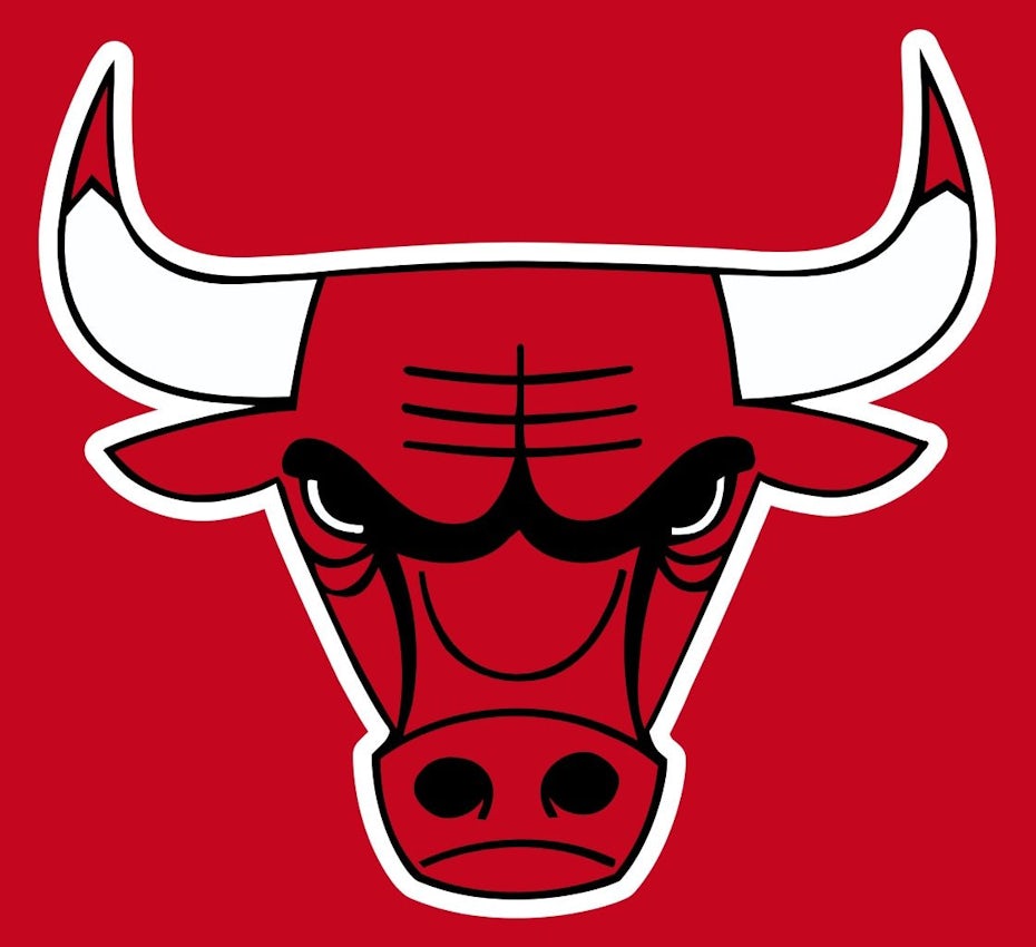
Chicago Bulls

One of the most effective logos is from one of sports most beloved franchises—the Chicago Bulls logo. This unmistakable logo is a great place to start when considering your own logo, just don’t turn it upside-down.
Here we see two of the most prominent design techniques in sports logos, the aggressive mascot and an abundance of sharp points.
Angry mascots are a staple of sports, and the teams’ logos tend to depict those mascots in an exaggeratedly aggressive way. The idea is to make your team seem powerful and strong enough to intimidate opponents and inspire fans.
Similarly, you see a lot of sharp points in sports logos, in this case the horns and even the ears. We’ll explain more about why they work below, but in short, sharp points energize a design and make it more dynamic.
Arsenal FC

The Arsenal Football Club logo takes a unique spin on the aggressive mascots mentioned above. While a cannon isn’t exactly an angry mascot, it is a serious weapon and a symbol of aggression, making it a good fit for a sports logo.
But the reason Arsenal’s logo stands out is its frame, in this case a shield. Your sports logo frame can add additional depth to you logo even if it’s simply a circle to unify the whole design and draw people in. The use of a shield, though, achieves the same ends as a circle, but also adds connotations of strength and fortitude, appropriate for the sports industry.
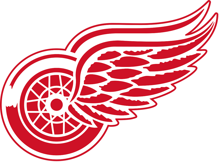
Detroit Red Wings

One of the most important principles of logo design is memorability. Remembering a logo is the first step in brand recognition. The right logo will serve as a beacon to loyal customers.
With sports logos, it’s hard to stand out when everyone is using the same design playbook. But the Detroit Red Wings break the mold about what a sports logo should look like. The result is something wholly unique and easily recognizable, not to mention adored by its fans.
The lesson: don’t be afraid to be weird, as long as it works. No one would have guessed a nonsensical flying wheel, designed in a semi-realistic manner (look at the detailed feathers and intricacy of the wheel hubs), would become one of the most iconic logos in sports.
New Zealand Rugby Union

As rugby is the national sport of New Zealand, it makes sense that the governing body would invest in their logo. After all, it serves a dual purpose of representing not just the organization that manages the country’s rugby teams, but also some of their teams.
What’s most impressive about this logo is that it manages to satisfy the requirements for both a business logo and a sports logo simultaneously. The stark black-and-white design with a simple, yet artistic visuals is right at home with company culture. At the same time, the vibrant images (including lots of the sharp angles mentioned above) and attention-grabbing typography check all the boxes for a sports logo.
Now that you’ve seen what sports logos are supposed to look like, let’s take a look at some practical advice for designing your own. Here are 5 expert tips for sports logo inspiration, and some examples of how they’re applied from our 99designs community.
Top tips and inspiration for creating amazing sports logos
—
1. Get aggressive
One of the most obvious sports logo trends is to use an exaggeratedly aggressive version of your mascot. Most of the time, this is an aggressive animal, typically an apex predator like a bear or big cat.
But don’t neglect one of the most fearsome animals alive, the human. While not as common as the angry animal, many teams use an iconic type of person, known for their fighting skills or just generally viewed as scary. More often than not, these are historical figures: specific cultures like the Spartans or the Romans, but also general figures like pirates, ninjas or medieval knights.
Of course, this trend depends on your sports team name, which unfortunately isn’t also up to you. The good news is that you can make stylistic choices to help whatever mascot you’re stuck with appear more frightening. A quick shortcut is to add a steep angle to their eyebrows—the “angry eyes” you see in every cartoon.
2. Sharpen your points
Designers know that the human eye instinctively follows any lines it sees. These gives certain shapes a specific emotional connotation, in other words, a specific “feeling” or “vibe.” For example, circles come across as playful because the eye goes around and around; horizontal lines come across as comforting because the eye goes back and forth in a level, stable way.
Sharp points, though, create a jarring effect when viewed—the eye must quickly double-back and dart in almost the opposite direction. This not only makes an image more visually interesting, but also tends to make the viewer more attentive, as if driving down a winding road.
That kind of alertness and invigoration is precisely what sports logos are going for with sharp angles. Along with the associations to knives and spikes and other aggressive imagery, the sharp angles stimulate viewers up and keep them on their toes. This is a trend we also see in metal band logos for similar reasons.
Sharp angles aren’t only for your mascot. More often than not, they’re also incorporated in the sports logos’ typography.
3. Energize your typography
You can’t rely solely on your sports logo’s image to convey the tone you want, you also need to work on your logo’s typography. For one thing, if your typography doesn’t match the imagery, your whole logo will seem off. Strong typography is also essential as the visual elements of logos are often dropped for jerseys or merchandise—the text of your team name will sometimes have to speak for itself.
As mentioned above, you can add sharp points to your lettering to keep both energy and enthusiasm high. Typically, this involves “spiking” the serifs. But if you look at enough sports logos, you start to notice other typography trends as well.
For example, the buckling of the middle of the word is also common, so that the first and last letters extend lower than the other to form an arch from the word shape. This adds a slightly 3D effect to your sports logo and makes it fun to read.
But you can also experiment with flashy fonts. Stuff that’s too garish for a business logo seems to fit naturally in a sports logo. Check out the way JK Graphix uses a stencil font below. A common favorite is lettering with small spikes in the middle, as seen in the logos for the Boston Red Sox, Oakland As and Pittsburgh Pirates—and the Seward County Saints below.
4. Focus on framing
The idea of framing in logos has deep roots in graphic design. On the surface, frames tie together all the elements of a logo, the visuals and the text, to help create a unified feel and to make the image more aesthetically pleasing.
But there’s also a deeper and more sub-conscious meaning. The logo’s frame suggests a sense of togetherness and unity, perfect for the community-building aspect of sports. A team needs a solid, unified fan base, and logos with frames encourage that. “You’re either with us or against us.”
Other industries rely mostly on circles for their frames, as circles are friendlier and more welcoming. But with sports logos, you want something more aggressive and powerful. Shields are common, as they represent strength and fortitude, but triangles also work well as symbols of authority and stability, not to mention their sharp points. Don’t be afraid to combine shapes to customize the feeling you’re going for. Notice how the Sydney Bears logo rounds the edges of its shield frame to appear more circular.
5. Find your symbol
The big league teams don’t need to explain who they are. Even casual fans know the Dallas Cowboys are an American football team. But unfortunately for small and local teams, that’s not the case. Before you get people to come to your games, you have to tell them what sport you play.
For small teams, an effective logo trend is to include some kind of symbolism in the design to show what sport you play and what you stand for. This could be as obvious as including a ball or instrument, but you can be as suggestive as you want.
No one roots for an uninspired team
—
Your sports logo is the first impression your team or brand will make with new fans, so it needs to be as impressive as possible. If your logo is powerful and commanding, people will flock to join your community.
If you’re having trouble getting your passion and athleticism across in your sports logo, consider hiring a professional. The right logo designer will bring your vision to life and create the perfect sports logo for you.
Article Provided By: 99 Designs

If you would like to discuss Your Web Development with Mojoe.net or your website’s analytics, custom logo designs, social media, website, web application, need custom programming, or IT consultant, please do not hesitate to call us at 864-859-9848 or you can email us at dwerne@mojoe.net.
