At a time when push notifications and never-ending open tabs keep competing for our attention, it may come as no surprise that this coming year, web design will be all about intuitiveness and clarity of use. In an environment that’s awash with information and stimuli, today’s websites need to be delivering their messages all the more clearly in order to stand out.
The following web design trends for 2020 are here to ensure clear and uncluttered websites, while still being rich with content and visuals. And above all, these striking trends can help you create a website that’s perfectly in style and up-to-date:
Top 10 web design trends for 2020
- Oversized type and elements
- Split screen content
- Solid color blocks
- Plenty of whitespace
- Exposed grid and windows
- Fluorescent 3D digital artwork
- Overlapping layers
- Motion and interactivity
- Fullscreen forms
- Tailored illustrations
01. Oversized type and elements
In order to communicate clearly and instantaneously, websites are favoring large, prominent elements. This magnitude in design applies to just about anything on a webpage, from big, bold typography, to fullscreen images and videos, and even oversized website menu icons.
Enlarged elements such as these are eye-catching, and help site visitors understand what the site’s all about right off the bat. Not to mention, they look great on any screen size. For this trend to truly shine, reduce the number of design elements on each page. Keep in mind that too many grand features all at once can be overwhelming and counterproductive.
As part of this trend, more and more websites opt for a fullscreen image or video on their first fold, paired with large typography. This layout serves in delivering a message plainly and efficiently, making sure that the most important information not only comes across, but truly registers – and resonates – with site visitors.

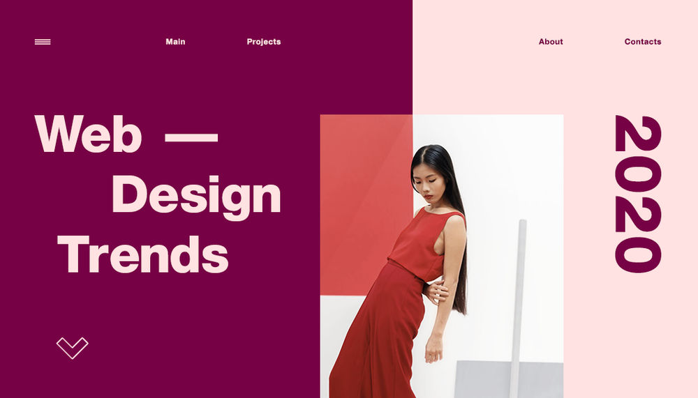
02. Split screen content
Have more than one idea to convey, but still want to retain an uncluttered look? Consider splitting your screen down the middle, allowing each side an equal spot in the limelight.
This captivating web design trend breaks the rectangular mold in two. And for a dash of extra pizazz, you can make each half of the screen behave slightly differently. For example, throw some surprising asymmetry into the mix by playing around with scroll effects and making each side move at a different pace.
To inject visual hierarchy into this partitioned design, place an additional element at the center of the screen, where the two halves meet. Those elements, which could be anything from your logo to a call-to-action (CTA) button or a menu header, will act as a focal point and balance out the screen.

03. Solid color blocks
Continuing on the split screen trend, some websites break up their content into even more parts, resulting in an array of differently sized squares and rectangles that are separated by color. This look can express several messages at once, in an orderly and cohesive manner.
With a photo or a few short lines of text placed in each section, it’s easy for site visitors to follow these bite-sized chunks of information. And to make the composition even more intriguing, be sure to color the squares in various shades from your website color scheme.
While this trend is about displaying a collection of items in a visually striking layout, the final result should keep away from haphazard collage work. The color blocks should come together to form a consistent composition, making the design intuitive and easy to understand. Make sure that the color blocks are neatly aligned to one another (a grid could come in handy here), and that all the different visuals complement one another.

04. Plenty of whitespace
Whitespace (or negative space) is a term referring to the blank areas in between the design elements. It gives any page or screen a spacious, well-balanced feel. And while most commonly white, whitespace can also be made up of any other background color. It includes the spacing between lines or columns of text, the space around each of the visuals, or the margins around the page.
Since whitespace is about leaving areas empty, it could be seen as an inefficient waste of space. When in fact, whitespace provides us with a breath of fresh air. It can increase legibility, highlight important design elements such as call-to-actions, separate independent sections, and create an overall tidy and pleasing appearance.
While whitespace has always been an important design principle, in 2020 we’ll see whitespace growing larger and more prominent – along with its adjacent images and type. We’re seeing harmonious designs with clean, expertly-executed typography, and images that appear to be floating freely in space. The ensuing look is pristine yet far from minimalistic, as the remaining visuals are large, bold, and colorful.

05. Exposed grid and windows
Web design is recently finding inspiration in none other than technology itself. By referencing iconography that we know all-too-well from our operating systems and apps, websites can express a look that’s both contemporary and slightly tongue-in-cheek.
Rectangles and strokes, or thin lines, divide up our screen into sections, guiding our eyes in the desired reading direction (a great practice for online skim reading). The grid and its guidelines, both design conventions usually reserved for behind-the-scenes work, are now exposed, as website designers highlight the segmentation of the screen and its building blocks.
Shapes reminiscent of pop-ups or browser windows, are now a seamless part of the page itself. This look can be nuanced, gently hinting at the familiar form, or more explicit with designs that wittily reference the early days of computers.

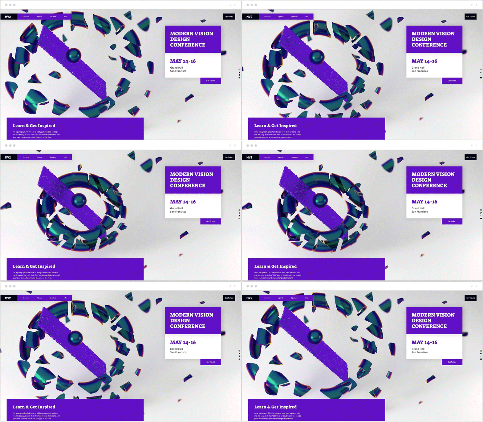
06. Fluorescent 3D digital artwork
Offering otherworldly interpretations to familiar materials, these digital 3D images adorn our websites in luminous, neon-colored shades. Artworks such as these act as tempting little eye-candy that lures in visitors’ attention, contrasted against a layout that’s clean and minimal.
The use of digitally rendered 3D artworks is not new in and of itself, but they’re now becoming more widely used. This could perhaps be traced down to the fact that 3D modeling programs are more accessible now than they’ve been previously. Combined with fluorescent colors, the result is futuristic and energetic, infusing any site with much personality.
Note that this web design trend should be used in moderation. Try to scatter fluorescent colors around the webpage as the complementary, or secondary, hues in your color palette. To balance those out, go for neutral shades as the primary colors, such as whites, blacks and grays.

07. Overlapping layers
Layering up elements within the webpage is an enticing way to add depth to our 2D screens, fostering the feeling that there’s more to the four corners of our screen than meets the eye. The layered effect can be achieved either by placing elements on top of one another so that they’re partially obscured from view, or by allowing additional content to pop into view once clicked.
While this look is rich with visuals that are literally piled on top of each other, when done well, the resulting composition will remain orderly and easily legible. This is achieved by the use of whitespace around the elements (as mentioned above) and hierarchy, with certain elements being larger and more prominent than others.
This look can be created with lightboxes, a parallax scrolling effect, or by masterfully positioning images or text on top of one another.

08. Motion and interactivity
Video and animation are far from being a new phenomenon on the web. After all, motion is an engaging, surefire way to grab site visitors’ interest, especially when designing for an audience with decreasing attention spans. Our eyes almost instinctively gravitate towards any moving element, a biological fact that can be utilized to control the way visitors perceive a certain page.
There are various forms of motion currently in abundance in web design: from micro-animations that provide feedback as we hover over or click on elements, to typography that runs across the screen, to fullscreen video headers or animations.
In order to make this trend work for you, think of what areas you’d like to draw the most focus to on your site. Bear in mind that motion can be distracting when misused, so be sure to apply it only in strategic places, in a way that supports your site’s storytelling.

09. Fullscreen forms
The overarching design theme for this year is large elements surrounded by generous amounts of whitespace. It’s therefore only natural that this trend has found its way into more seemingly mundane niches of web design, such as the online form.
Online forms play an integral part in so many of our web interactions, from signing up to a service, to filling in our delivery information on an online store, and much more. Yet at times, they feel like a tedious chore, and users often refrain from filling them in. The simple act of expanding a form so that it takes up more room on the page, makes it more inviting to interact with. As a result, fullscreen forms can improve user experience.
Another feature that can increase the likelihood of users filling out and submitting a form, is micro-interactions that respond to the users’ actions in real time, guiding them through the process. For example, subtle design changes can signal that a certain field has been filled in, and feedback messages can mark a successful form submission.

10. Tailored illustrations
Websites harness a plethora of visual tools in telling a compelling story. With anything from illustrations to icons and photographs, visuals are no longer just placeholders to merely add some color to the page. Instead, web design is intentional in its use of imagery, utilizing visuals to support the message and craft a brand identity.
Indeed, the right placement of illustration can make a big difference. For example, think of a skateshop’s website that’s full of street-art inspired graphics. In comparison, a nonprofit website whose feel-good visuals bring up a sense of optimism, sends a different message all together.
To form a coherent visual language that encapsulates your brand’s vision, browse vector art collections for unique illustrations, icons and badges. Additionally, invest time in going through high quality media features to find images that are perfectly tailored to your brand’s specific needs.

 If you would like to discuss Your Web Design Needs with Mojoe.net or your website’s analytics, custom logo designs, social media, website, web application, need custom programming, or IT consultant, please do not hesitate to call us at 864-859-9848 or you can email us at dwerne@mojoe.net.
